
Official statistics provide income and wealth insights
In the latter part of 2011, the Australian Bureau of Statistics released three publications [1] that together provide valuable insights regarding household income and wealth in Australia. The surveys supporting the statistical releases were conducted in 2009-10.
The publications provide the most comprehensive and up to date data, on a state and national basis, for a number of key financial planning and wealth management “progress indicators”. In this article, we will focus on how those in the top quintiles (i.e. top 20%) by household net worth and income are performing in terms of benchmarks we monitor for our clients. The aim is to assess the “financial health” of the nation’s wealthiest 20%.
In a follow-up article, we will examine some potentially interesting differences between those in the top quintile as measured by household income and by household net worth. In summary, high income does not always imply high net worth and the statistics offer some clues as to why this is the case.
How is the financial health of our wealthiest 20%?
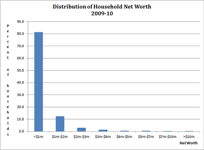
Before concentrating on the financial health of the “Top 20%”, some context is obtained by looking at the distribution of household wealth and income for the entire population. The chart below shows the distribution of household net worth (i.e. total assets less liabilities) and reveals that a little over 80% of households has net worth less than $1 million.
Only an estimated 1% of the population (i.e. 88,300 households) has net worth in excess of $5 million, with just 0.3% having more than $10 million. We suspect avid consumers of financial and lifestyle media would be surprised by these findings. Significant wealth is much rarer than the marketers would have us believe.
The following chart shows the distribution of gross annual household income.
The median or middle gross household income is about $68,600 p.a. There are only an estimated 473,200 households (or 5.6% of the population) with gross incomes in excess of $208,000 p.a.
The table below shows the average values of selected key financial indicators for the top quintiles by household net worth and gross household income, compared with the total population:
| Financial Indicator | Highest Quintile by Net Worth | Highest Quintile by Gross Income | Population |
| 1. Net Worth ($’000) | 2,223.0 | 1,430.7 | 719.6 |
| 2. Lifestyle Assets ($’000)* | 951.2 | 700.8 | 446.8 |
| 3. Net Investment Wealth ($’000)** | 1,271.8 | 729.9 | 272.8 |
| 4. Superannuation ($’000) | 370.3 | 256.8 | 115.9 |
| 5. Direct Property/Businesses ($’000)*** | 797.1 | 560.1 | 198.6 |
| 6. Total Investment Assets ($’000) | 1,452.1 | 1,004.6 | 392.6 |
| 7. Total Liabilities ($’000) | 180.3 | 274.7 | 119.8 |
| 8. Gearing (%) **** | 12.4 | 27.3 | 30.5 |
| 9. Annual Spending ($) | 89,284 | 112,320 | 64,272 |
* Main residence, motor vehicles etc
** Net Worth less Lifestyle Assets
*** Direct Property excludes own home
****Total Liabilities divided by Total Investment Assets (i.e. (7)/(6))
The data above is used to construct approximate measures of various financial planning metrics we focus on to assess our clients’ progress. They are provided in the table below, together with a minimum indicative benchmark measure we regard as consistent with financial independence (see “How does your “Personal Financial Scorecard” look?” for further explanation).
| Metric | Highest Quintile by Net Worth | Highest Quintile by Gross Income | Population | Benchmark |
| Net Investment Wealth/Net Worth (%) | 57.2 | 51.0 | 37.9 | >55.0 |
| Tax Effectiveness Ratio (%) | 29.1 | 35.2 | 42.5 | >75.0 |
| Retirement Expenditure Multiple | 14.2 | 6.5 | 4.2 | >25.0 |
| Investment Risk Ratio (%) | 45.1 | 44.2 | 49.4 | >75.0 |
In terms of achievement of financial independence, the following observations are made:
- On average, too much of net worth is dedicated to lifestyle, rather than investment assets;
- Insufficient investment wealth is being held in the tax effective superannuation environment;
- Net investment wealth is well short of being able to sustain current expenditure indefinitely, with the retirement expenditure multiple looking woefully inadequate for those in the highest quintile by income and for the population in total; and
- Investment diversification is low – too much wealth is concentrated in relatively illiquid property holdings and businesses.
In summary, the financial affairs of our wealthiest 20% as measured by either net worth or income don’t, on average, appear to be well structured, while the position of the average Australian household is particularly poor. The Australian love affair with direct property, both as a lifestyle and investment asset, is evident with the average household holding almost 70% of net worth in this concentrated and illiquid form.
Wealth or income are not reliable measures of financial health
Averages hide a lot of information, but it is hard to escape the conclusion that even Australia’s wealthier households are not well positioned for financial independence. However, it is apparent that the top quintile as measured by net worth appears better placed than the top quintile as measured by gross income. Our next article will examine this issue more fully.
The message that we think should be taken from the above analysis is that looking like the average wealthy household is not the way to achieve financial independence. You need to structure yourself to meet your lifestyle objectives, rather than take guidance from somebody who you think looks like you.
[1] The ABS releases are:
- 6554.0, “Household Wealth and Wealth Distribution, Australia, 2009-10”, released 14 October 2011;
- 6523.0, “Household Income and Income Distribution, Australia, 2009-10”, released 30 August 2011; and
- 6530.0, “Household Expenditure Survey”, released 6 September 2011.


1 Comment. Leave new
[…] our previous article, “Household income and wealth in Australia”, we examined the progress toward financial independence being made by the wealthiest 20% of […]