
High level aggregate data suggest household balance sheets are in good shape …
In both actual dollar terms and relative to household incomes, Australian households have never been wealthier. The chart below (or a variant of it) is often used to demonstrate that despite the potentially worrying levels of debt being taken on by households, net wealth as a percentage of income has completely recovered from GFC lows and now exceeds the previous pre-GFC, September 2007, high.
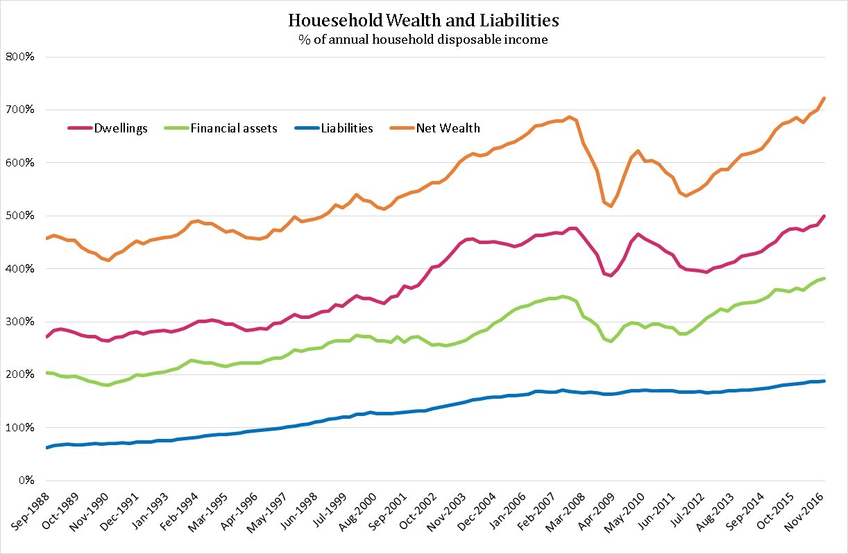
Increases in the values of dwellings and financial assets since March 2009 have more than offset increases in the value of liabilities (primarily increases in housing related debt), suggesting household balance sheets, at least at the aggregate level, are in good shape.
A number of commentators use this chart to refute the claims of housing and housing debt doomsayers that suggest households are borrowing too much, housing values are too high and the economy sits on the edge of a precipice. The doomsayers argue that dwelling oversupply and/or increased housing loan defaults could see house prices and housing wealth collapse savagely, plunging the economy into recession.
We don’t know what the future holds. But we don’t take any comfort from seeing net household wealth rise relative to household income, driven by increasingly expensive asset prices (relative to incomes) and rising debt. At some point, these prices will become (if they’re not already) “too high”, exposing those with high levels of borrowing to at least unrealised losses and, in a major adjustment, significant realised losses.
This article looks at data underpinning the household wealth chart shown above to better understand aggregate household financial behavior. It supports the view that the national household balance sheet has become increasingly fragile but can’t say whether it’s “too fragile” and a collapse is imminent.
… but there are some concerning long run trends
The first chart below looks at the change in the composition of aggregate household assets, from September 1988 – December 2016.
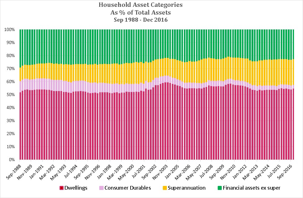
Somewhat unexpectedly, it reveals that dwellings as a percentage of total household assets have remained reasonably constant over the period, rising from 52.2% of total assets as at September 1988 to 55% at December 2016. Less surprisingly, superannuation has risen from 10.4% to 19.8% over the period, offset by falls in financial assets less super and consumer durables.
The next chart shows how household assets have been funded i.e. by borrowings or households’ equity (i.e. net wealth).
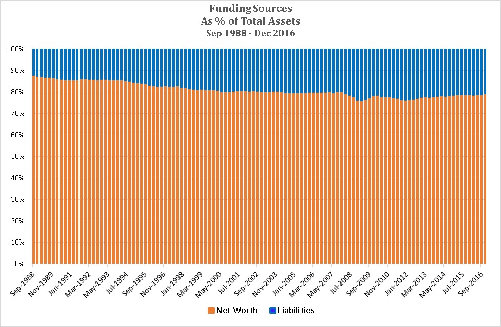
Over the period, liabilities (primarily borrowing for housing) have grown from 12.1% to 20.7% of total assets i.e. household balance sheets have become increasingly leveraged. While the 8.6% rise of assets funded by liabilities may not sound like much, it is important to understand that the data is for all households, many of whom do not have any borrowings. The increased leverage reflects both more households with borrowings and higher levels of borrowing, resulting in higher levels of financial risk.
Liability funding (i.e. leverage) reached a maximum of 24.0% in March 2009, primarily due to the significant fall in asset values during the GFC rather than large increases in borrowings. Since 2009, leverage has fallen because asset values have risen relatively faster than liabilities have increased.
We don’t find this reduced leverage comforting. The table below provides details of how liability funding changed from previous wealth (to income) peaks to their subsequent lows:
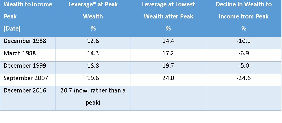
It shows that for all significant declines (of 5% or more) of Household Wealth, leverage increased due to relative declines in asset values. Leverage at each Household Wealth peak was higher than at the previous peak. A potential concern now is that leverage is currently above that of the previous wealth peak in September 2007.
The next chart below examines how the key components of household wealth and household income have grown over the period under examination. The vertical axis is a logarithmic scale, enabling changes in growth rates to be more easily identified.
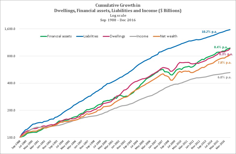
It shows liabilities have grown significantly faster than asset values, resulting in net wealth growth lagging growth in asset values. This also explains the increased leverage discussed above. However, liabilities simply can’t keep on growing faster than assets for ever, as negative household net wealth would be the eventual result. But it’s not easy to identify when liabilities have become excessive.
Also clear from the chart is the failure of household income growth to keep pace with the growth in asset values, particularly since around 1996-97. A clear flattening in income growth from the bottom of the GFC around March 2009 is evident, while asset values bounded ahead to their currently unprecedented multiples of income. This trend also can’t continue indefinitely, but what will precipitate a fall in asset values relative to income? Lower asset value growth and/or higher income growth?
Borrowing to invest looks riskier than ever
Rising household wealth, relative to income, is a mixed blessing even though it may feel good! We don’t believe the trends underpinning this rising household wealth are sustainable. The longer they last, the more inevitable it is that some adjustment will occur.
Unfortunately, even if our view of the trends is correct, it gives no clear insight as to how and when that adjustment will occur. While it is easy to see potentially catastrophic scenarios for highly leveraged borrowers, a more benign outcome could result if the adjustment primarily occurred through a relative acceleration in household income growth.
However, the aggregate household data does suggest that, although borrowing to invest strategies are always high risk, risk is currently at elevated levels.