Everyone knows higher returns mean higher risk...
We all should know you can’t get higher investment returns without taking higher risk, but judging by the chaos in financial markets since about July 2007 even this simple message was either not understood, not believed or just ignored.
However, higher risk does not guarantee higher returns. In the view of the world’s leading investment researchers, you bias your chances in favour of obtaining higher returns by only taking risk that has been reliably rewarded in the past and can be expected to be rewarded in the future. There are risks worth taking and risks that are not.
A five factor model of investment risk...
The research shows that financial risk can be thought of in terms of five factors or dimensions:
Credit risk refers to the possibility that your initial investment will not be repaid and/or promised return will not be received, due to default by the entity in which you invested. Term risk arises when you invest long term in a fixed interest investment and the value fluctuates when the general level of interest rates rises (value of investment falls) or falls (value of investment rises).
Our philosophy is that the purpose of making investments in cash or fixed interest instruments (i.e. defensive assets) is not to maximise return but to ensure that the defensive component of your total investment portfolio is as risk free as it practically can be. Its purpose is to reduce overall portfolio volatility.
Therefore, we advocate that defensive assets should be held in short term investments of high credit quality. History has shown that the expected higher returns from investing in lower grade credits (e.g. Westpoint, MFS, Basis Capital, Fincorp) and/or longer dated instruments do not adequately compensate for the additional risk.
If higher returns are needed, the investor should look to the other risk factors that have been reliably rewarded in the past and can be expected to be rewarded in the future. We discuss these next.
Three factors explain share returns...
The research indicates that to maximise your chances of receiving an adequate premium for taking greater risk than that inherent in a high quality cash/fixed interest portfolio, you should allocate a component of your investments to the sharemarket i.e. the market factor.
While investing in shares brings considerable risk, over the long term this risk taking has been well rewarded. The chart below shows that from January 1926 – June 2008, the US sharemarket, as measured by the S&P500 Index (index of value of 500 largest US shares), returned 6.2% p.a. above the return from investing in US Government one month Treasury Bills, a measure of the risk free return.
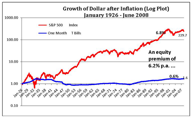
While it cannot be guaranteed that the premium for taking sharemarket or equity risk will be as well rewarded in the future, investors will not invest in the sharemarket if they do not believe that prices are at a level where they can expect to get a future return in excess of the risk free rate. Shares are clearly riskier than money in the bank and an expected equity risk premium is required (that varies with market sentiment) to encourage investment.
Next, if higher returns than that expected from the overall sharemarket are sought, the research suggests that an investor should bias the share component of their portfolio to the size factor and/or the price factor.
What is the "size" factor?
The size factor refers to the evidence that over the long term small shares – as measured by their relative market value or capitalisation – have tended to outperform large shares. Small shares are also expected to outperform large shares in the future, because they are considered riskier. The market discounts the price of small shares relative to large shares (and, hence, increases their expected returns) to reflect the perceived higher risk.
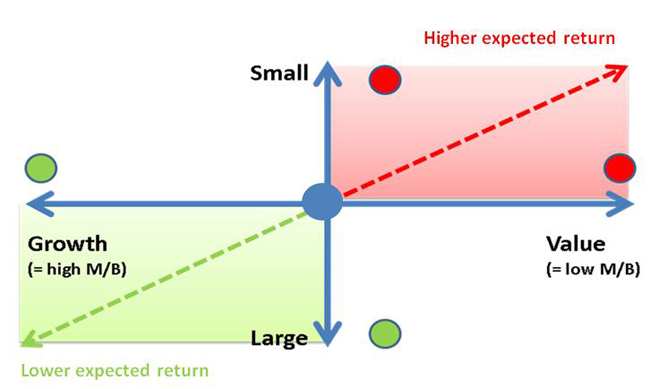
In the diagram below, the blue circle represents a share portfolio that looks and behaves like the overall sharemarket – it has no bias to the size or price factors. The red circle is a portfolio with a strong bias to small shares, with the green circle a portfolio with a high proportion of large shares. The expected (but not guaranteed) returns for each portfolio are shown on the right hand side, with examples of small and large Australian shares shown on the left.
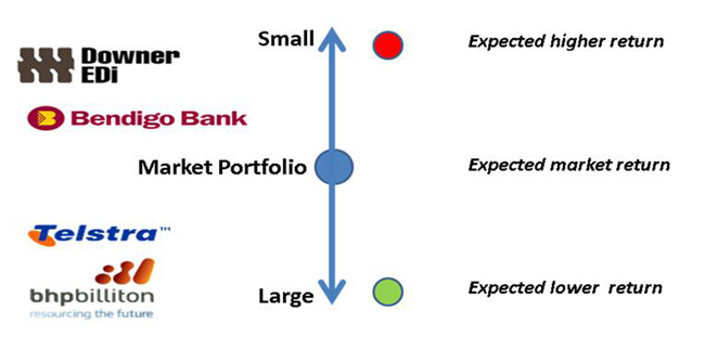
Just as a bank would require a higher margin to lend to Downer EDI (a “small” share) than to BHP Billiton (a “large” share), because the former is seen as riskier, share investors expect a higher return to entice them to hold Downer EDI shares in preference to BHP Billiton shares . Capitalism couldn’t work any other way.
What is the "price" factor?
The price factor is less intuitive than the small factor, but it summarises the research that identified that over the long term relatively low priced or value shares have outperformed relatively high priced or growth shares. Again, the financial economists argue that value shares are expected to outperform growth shares in the future, because they are riskier.
The diagram below illustrates the working of the price factor, in a manner similar to the size factor described above, together with some Australian share market examples of value and growth shares as at August 2008.
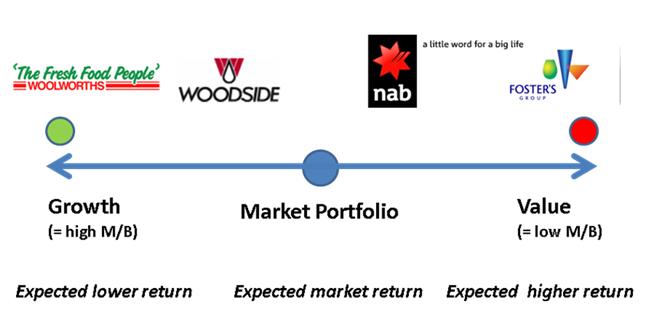
The example shares give some flavour for the difference between value and growth shares. Growth shares are “market darlings”. They tend to have outstanding track records, respected management, strong market positions. Woolworths in 2008 is a prime example – it is priced for continued perfection. Given growth stocks are seen as lower risk – the “blue chips” – it is only sensible that they have lower expected returns.
Value shares, on the other hand, are for whatever reason “out of favour” shares. As at August 2008, National Bank was under pressure because of problems associated with the sub-prime crisis. Fosters was burdened by an underperforming wine business and question marks over management. To entice investors, share prices are pushed down to the point where expected returns are sufficiently high to compensate for the perceived higher risk of investing in such unpopular offerings. For a more detailed explanation of the “Price factor”, see the Appendix, titled “What is a value share?”.
The highest expected returns are achieved by having a share portfolio that sits in the top right hand corner of the above diagram, with a strong small and value bias. But this comes at the cost of high risk. Alternatively, a portfolio that sits in the bottom left hand corner with a strong large and growth bias has lower expected returns, but much lower risk. A portfolio with no biases can be expected to have returns that look like the total sharemarket, with a similar level of risk as the market.
There is no preferred portfolio. Given our view that “markets are fair”, any diversified share portfolio will be priced to reflect its underlying risk/return characteristics. The benefit of the three factor model is not that it can identify the “best” portfolio but that it provides a systematic way to take increased investment risk in a manner that research shows has been reliably rewarded in the past and is expected to be rewarded in the future.
The complete three factor model is illustrated below:
Three factor model versus investment practice...
The research has shown that about 95% of the variation in the long term returns of any well diversified share portfolio is explained by the three risk factors described above. The rest is essentially “noise”.
Applied to portfolio construction, the model suggests that the expected long term returns of a share portfolio will almost totally be driven by:
If this is the case, it suggests that a lot of what is written and spoken about sharemarket investment is simply “noise”. If you are a serious long term investor, who wants to give yourself the best chance of receiving an adequate reward for risk taken, you are better off paying no attention to the following (except for entertainment value):
In fact, their relevance to you is probably inversely related to the amount of “noise” they make.
The evidence for the three factor model...
The original research on which the three factor model is based was published in 1992 by Professors Eugene Fama of the University of Chicago and Ken French of Dartmouth College. Since then additional research, both in the USA and in other developed country sharemarkets, has tended to provide confirming support for the validity of the three risk factors.
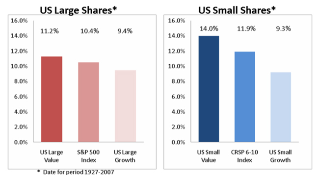
The chart on the left, “US Large Shares”, compares the performance of US large value shares with US large growth shares and the index or benchmark for US large shares, the S&P500. It shows value (11.2% p.a.) considerably outperformed growth (9.4% p.a.).
The chart on the right, “US Small Shares”, compares the performance of US small value shares with US small growth shares and the market benchmark for small shares, the CRSP 6-10 Index. The small share index (11.9% p.a.) outperformed the large share index (10.4% p.a.), while small value (14.0% p.a.) considerably exceeded the performance of small growth (9.3% p.a.).
The charts below provide the long term evidence for the United States for the period from 1927-2007.
Source Data:
Annual Data in US Dollars
Value and growth data provided by Fama/French. CRSP data provided by Centre for Research in Security Prices, University of Chicago.
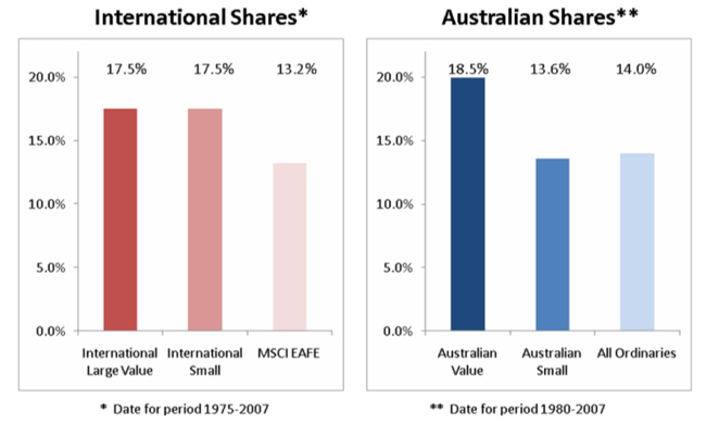
For the chart on the left, the MSCI EAFE is the index for large international shares, excluding the US. For the period shown, international large value shares (17.5% p.a.) and international small shares (17.5% p.a.) both exceeded the returns of the international large share index (13.2% p.a.).
The Australian experience, shown on the right, reveals that Australian value shares (18.5% p.a.) considerably outperformed the market index, the All Ordinaries (14.0% p.a.). However, Australian small shares (13.6%) marginally underperformed the market index – over this period, the size factor was not evident. Is Australia different? Can we expect large shares to continue to outperform small shares in future? Only if you believe that large shares are riskier than small shares and/or markets do not work in Australia!
Source Data:
International shares are in US Dollars; Australian shares are in Australian Dollars
International Large Value provided by Fama/French
International Small Cap Index: 1975-June 1981:50% UK Small Cap Stocks and 50% Japan Small Cap Stocks; July 1981-December 2007: Simulated by Dimensional Fund Advisors from style research securities data
Australian Value: Fama/French simulated data to January 1994; live gross returns provided by Dimensional Fund Advisors from January 1994 to December 2007
Australian Small: Constructed from various small shares series to October 2000; live gross returns provided by Dimensional Fund Advisors from October 2000 to December 2007
Risk is the cause, returns are the effect...
Risk drives returns. The key decision an investor needs to make is how much risk they need to take and are comfortable taking. Once that is decided, the five factor approach to risk enables the investor to structure a portfolio to provide the best chance of being appropriately rewarded for the chosen level of risk.
Appendix: What is a "value" share?
Is "value" in the eye of the beholder?
Usually, when active fund managers say they are “value” investors it means they try to identify shares that are mispriced (i.e. priced too low) and are expected to outperform the market in future. This is certainly not what Professors Fama and French were referring to when they indentified the “Price” risk factor in their groundbreaking 1992 paper titled “The Cross Section of Expected Stock Returns”.
Fama and French’s research showed that over the long term relatively low priced shares outperform relatively high priced shares – the lowest priced shares are called “value” shares and the highest priced shares are called “growth” shares. They assert that the higher returns of value compared with growth are nothing to do with mispricing, but are compensation for the higher risk of value shares compared with growth shares. But what do they mean by relatively low priced and relatively high priced shares?
“Value” and “Growth” by Fama and French
In their original research, Fama and French trawled through masses of data to find what variables or factors best explained the variation in the historical returns of share portfolios. Out of this research came their three factor model, showing three factors – market, size and price – explained about 95% of the variation of returns of well diversified share portfolios.
They found that a number of price related ratios had high explanatory power e.g. dividend yield (i.e. D/P, where D=dividend/share, P=share price), price earnings ratio (i.e. P/E, where P= share price, E=after-tax earnings/share) and market to book ratio (i.e. P/b where P=share price, b=accounting book value/share). However, the market to book ratio was the preferred measure of relative price (or the price factor) because it was subject to less fluctuation than the alternative price ratios and had at least equivalent explanatory power.
The Fama and French research ranked all US shares by their market to book ratios. The top 30%, with relatively high sharemarket values compared with their accounting book values, and hence relatively expensive or high priced, were called growth stocks. The bottom 30%, with relatively low sharemarket values compared with their book values, and hence relatively cheap or low priced, were called value stocks.
Fama and French determine value and growth objectively – they are defined terms. What is a growth share and what is a value share change constantly because relative market values of shares are changing constantly. A share’s reported book value adjusts more slowly, but over extended periods changes in book values will also have an influence on the determination of what is a value share and what is a growth share.
Woolworths and Fosters
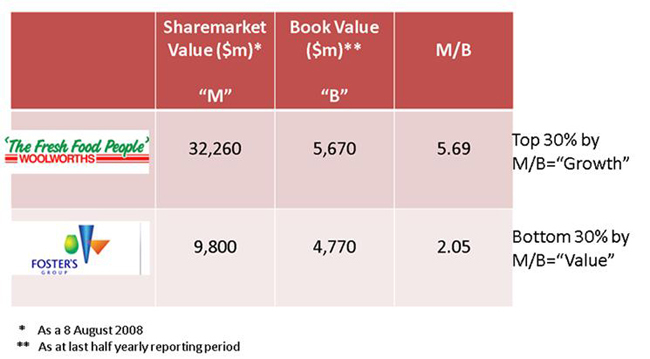
Despite Woolworth’s book value being only about 19% greater than Fosters’, its sharemarket market value or capitalisation was 230% larger than Fosters. As a result, its market to book ratio was more than twice that of Fosters. In terms of the Fama and French research, Woolworths is a relatively high priced (and relatively lower risk) growth share and Fosters is relatively low priced (and relatively high risk) value share.
The research does not suggest Fosters will outperform Woolworths over the long term. It reveals that in the past diversified portfolios of relatively low priced shares, that included shares like Fosters, have outperformed diversified portfolios of relatively high priced shares, that included shares like Woolworths. Fama and French expect that well diversified portfolios of relatively low priced shares will outperform well diversified portfolios of relatively high priced shares over the long term because low priced shares are riskier.
To make the above discussion a little more tangible, the diagram below calculates and compares the market to book ratios for Woolworths Limited (an Australian growth share) and Fosters Group Limited (an Australian value share) as at August 2008:
